x-y plots
Python programmers: Not so fast!
You probably saw the title of this page, thought “I don’t need this; I know matplotlib,” and were tempted to skip it.
Give this page a skim. There are features of ROOT’s TGraphErrors
that are not in matplotlib, such as interactive plots.
It’s OK to decide to stick with matplotlib if you feel more comfortable with it, but at least make the choice as an informed decision.
The main ROOT tools for creating x-y plots are:
TGraph for x-y plots without error bars; e.g., plots that consist mostly of lines and curves.
TGraphErrors for x-y plots with error bars (in y, x, or both).
When I want to create a ROOT plot that is not a histogram, I usually look at the graphs examples in the ROOT tutorials. If you use the method I discussed in the References section, you can see these files on your system with:
cd `root-config --tutdir`/graphs
ls
The two examples I look at most often are:
Let’s focus on graph.C. First the program sets up some example data points:
import numpy as np
import math

# Set up example points to plot.
n = 20
x = np.empty(n,float)
y = np.empty(n,float)

for i in range(n):
    x[i] = i*0.1
    y[i] = 10*math.sin(x[i]+0.2)
// Set up example points to plot.
const int n = 20;
double x[n], y[n];
for (int i=0;i<n;i++) {
    x[i] = i*0.1;
    y[i] = 10*sin(x[i]+0.2);
}
Now that we’ve got the points, the goal is to create this plot:
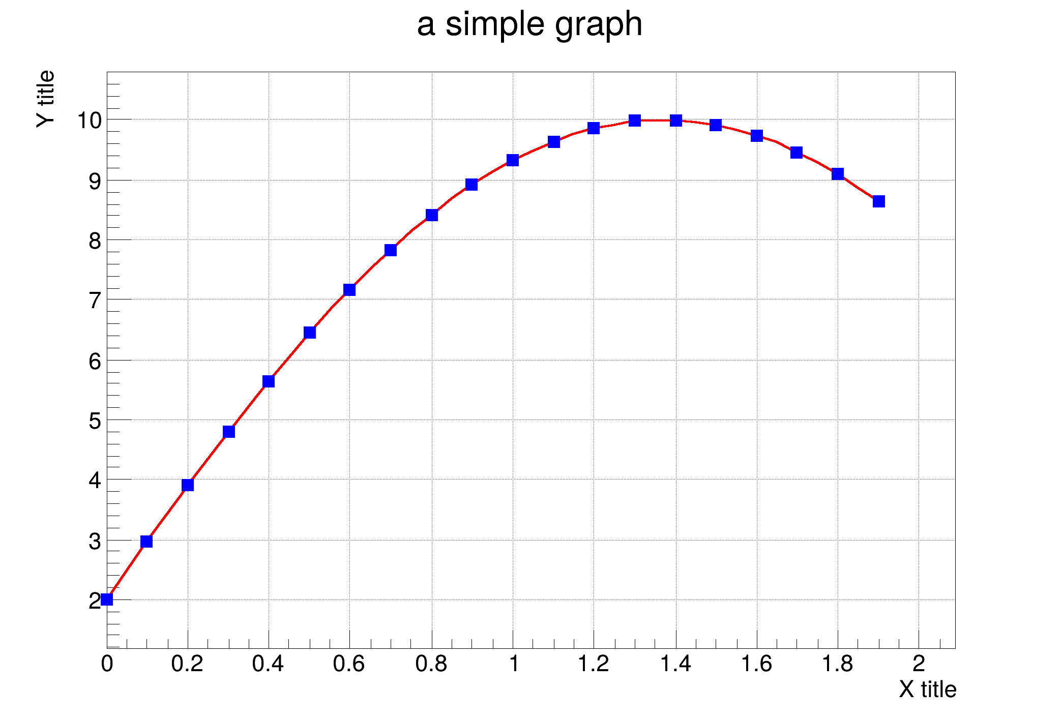
Figure 68: The x-y plot from graph.C.
Here’s the C++ code in graph.C. I copied it and added lots of comments:
// Define a default canvas
TCanvas *canvas = new TCanvas();

// In ROOT, a grid is a property of the canvas,
// not the graph.
canvas->SetGrid();

// Define our graph, using the points we defined above.
TGraph *graph = new TGraph(n,x,y);

// Set the properties of the plot.

// Line attributes are defined in TAttLine
graph->SetLineColor(kRed);
graph->SetLineWidth(4);

// Marker attributes are defined in TAttMarker
// Colors are defined in TColor.
graph->SetMarkerColor(kBlue);
graph->SetMarkerStyle(21);

graph->SetTitle("a simple graph");

// Axis properties are defined in TGAxis
graph->GetXaxis()->SetTitle("X title");
graph->GetYaxis()->SetTitle("Y title");

// From TGraphPainter: A = plot axes, C = plot a curve, P = plot points
graph->Draw("ACP");

// In a notebook, after we draw a graph, we have to draw its canvas
canvas->Draw();
Here’s the same code in Python. They don’t look all that different, do they?
import ROOT

# Define a default canvas
canvas = ROOT.TCanvas()

# In ROOT, a grid is a property of the canvas,
# not the graph.
canvas.SetGrid()

# Define our graph, using the points we defined above.
graph = ROOT.TGraph(n,x,y)

# Set the properties of the plot.

# Line attributes are defined in TAttLine.
# Colors are defined in TColor.
graph.SetLineColor(ROOT.kRed)
graph.SetLineWidth(4)

# Marker attributes are defined in TAttMarker
graph.SetMarkerColor(ROOT.kBlue)
graph.SetMarkerStyle(21)

graph.SetTitle("a simple graph")

# Axis properties are defined in TGAxis
graph.GetXaxis().SetTitle("X title")
graph.GetYaxis().SetTitle("Y title")

# From TGraphPainter: A = plot axes, C = plot a curve, P = plot points
graph.Draw("ACP")

# In a notebook, after we draw a graph, we have to draw its canvas
canvas.Draw()
For your convenience, here are links to the classes I mention in the comments:
TGraphPainter for general options when plotting graphs (e.g., the type of graph; axis placement; lines vs. curves).
TAttMarker for the color, shape, and size of markers (the points in an x-y plot).
TAttLine for the color, width, and style (solid, dotted, dashed) of lines on the graph.
TGAxis to control parameters of the axes (e.g., linear vs. log; tick position; labels).
TColor for the full range of colors available for a graph’s elements.
matplotlib comparison
If you’re a Python programmer:
Thanks for being willing to read this far!
How is this different from using matplotlib?
Let’s start with the matplotlib equivalent of Listing 46:
import matplotlib.pyplot as plt

plt.plot(x,y,
         linestyle='solid',
         linewidth=4,
         color='red',
         marker='s',
         markeredgecolor="blue",
         markerfacecolor="blue",
        )
plt.grid()
plt.title('a simple graph')
plt.xlabel("X title")
plt.ylabel("Y title")

None
If your first reaction is “The matplotlib version is much shorter!” then you’re being misled by all the comments in Listing 46. I count 13 executable lines in the ROOT code, 13 lines in the matplotlib code (not including the closing parenthesis on its own line). In other words, in terms of lines of code, they’re both of equal complexity.
The reason why I prefer ROOT over matplotlib is the interactivity after I’ve created the graph. I went into detail about this in Interactive plots and Magic commands. To recap:
In command-line ROOT, you can use the same tools you learned about in Walkthrough: Plotting a function and Walkthrough: Saving and printing your work to interactively edit your plot’s appearance, save it as a .C macro, then examine the macro to learn the ROOT commands to get a plot to look the way you want.
In a ROOT notebook, you can use the %jsroot magic command to make an x-y plot interactive, so you’re able to modify the plot in much the same way as in command-line ROOT. The difference is that you can’t save the plot as a .C macro… at least, not yet!
Of course, complexity and interactivity are subjective. In a typical Python notebook matplotlib graph, you make your plot, adjust code parameters, and hit SHIFT-Enter to update the plot. This may be sufficient for your needs.
At least now you know you have a choice!